

Wine LAbel Design / WINE LABEL Illustration
Earthshaker Wine Label Design
CLIENT
Earthshaker Wines, Latitude Beverage Co.
CASE STUDY
Art-forward wine labels that capture your attention
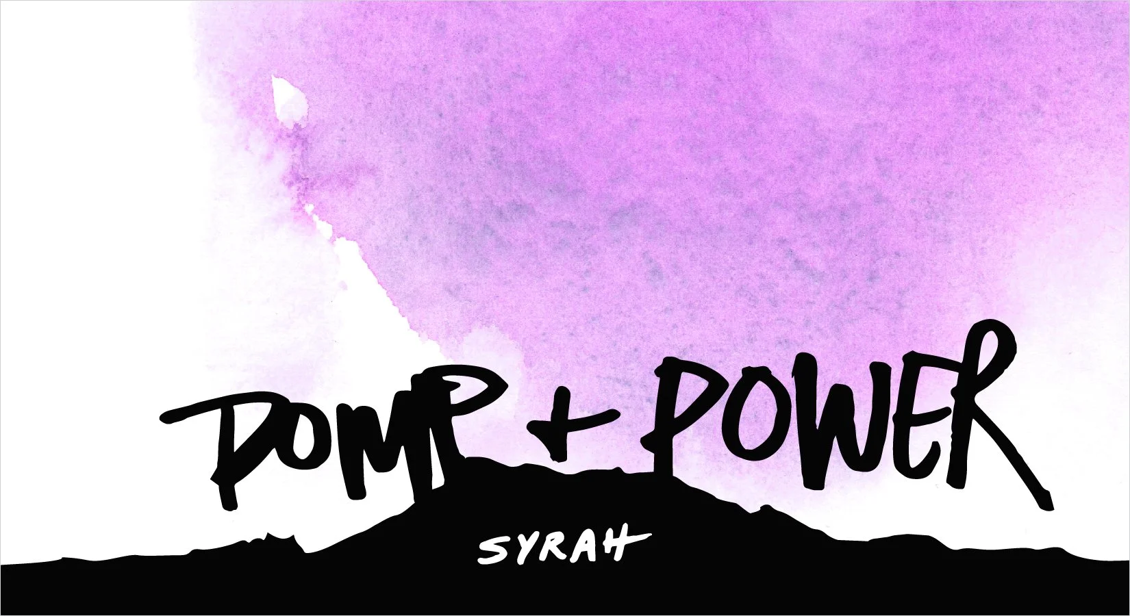
This assignment had the most delightful, open-ended description: Create labels that express "Mother Nature's graffiti" for a series of wines that are off the beaten path. We started with Pomp and Power, a Syrah from Sonoma County, California that is grown on the Eastern side of Mount St. Helena. I imagined the famous volcano smoldering and steaming over the course of several millennia, making the terroir perfect for this moment of wine making. The bright, violet watercolor smoke billows up against bold, graphic silhouettes of the mountain range, while the graffiti-like hand written name tags a statement across the landscape with pomp and power. Big and bold, like the wine itself.
“We wanted the brand to be somewhat puzzling—mysterious and fantastic, but also pay respect to the history and tradition.”
- Brett Vankoski, Earthshaker Wines


The brand started with Pomp and Power Syrah, and that set the tone for the other 7 wines in the series. Often my work begins with pencil sketches and ideas in my sketchbook, and they spark conversations with my clients that bring us to unexpected and fantastic results. Working with Earthshaker wines was a very creative, fun process—the whole way through.
Next in the series came La Quête an obscure red from Lirac in France’s Languedoc region. Again, the terroir and history set the stage

“Unique sense of style and sharp eye for design. Working with her for 8 years has been such a pleasure. She’s kind, intelligent and professional. She works quickly and efficiently to meet deadlines. Her specific attention to detail aid in elevating and bringing value to our brand by creating a cohesive look across our portfolio.”


