Package Design / Illustration
Little Leaf Farms Lettuce Packaging
CLIENT
Little Leaf Farms has some of the most high-tech and innovative hydroponic greenhouses in the world! And super tasty lettuce to boot.
CASE STUDY
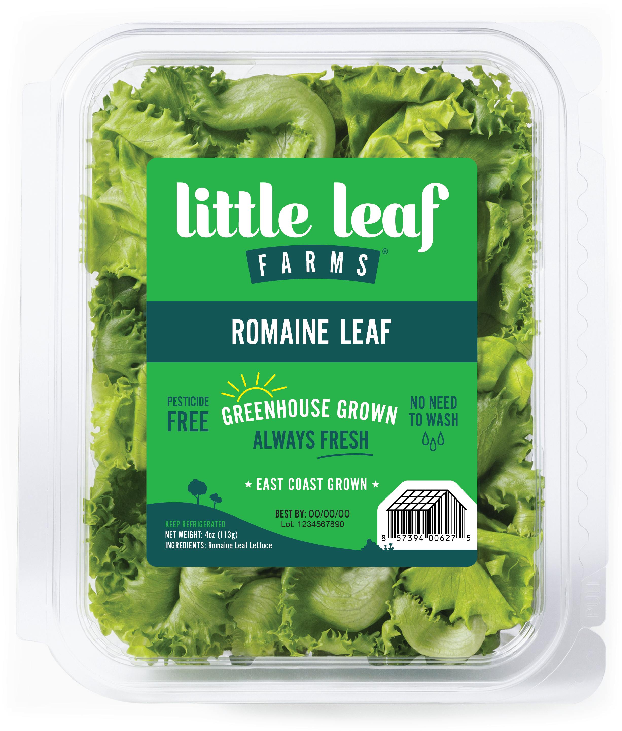
A unified graphics and color story for packaging—designed to grow with the brand
I was hired to refresh their lettuce packaging after 10 years in the same look. They wanted to keep the color blocking for customers to easily recognize them in the bustling store setting, while also driving home their core messaging in a fresh, illustrative way.
We landed on a sweet landscape scene, cleverly utilizing the UPC code and pulling in some simple illustrative motifs that were successful with the Salad Kits we launched last year. For the messaging: We boiled down and simplified until there was ONLY communication that represented what their customers truly care about.

“For our redesign, we needed to maintain our Little Leaf POP on the shelf that our customers are used to, while also delighting them with a fresh update that the lettuce they love deserves.”
- JEANNIE HANNIGAN, MARKETING DIRECTOR

1. The Challenge
Little Leaf knew they wanted to shift the messaging and look of their packaging, but didn’t want to confuse their current patrons or lose the grocery store shelf presence they already have. We needed to preserve their color story and brand feel while adding MORE Little Leaf personality to their lettuce products.
2. The Process
After a year of research and development we created a fresh and unique brand-aligned packaging strategy for Little Leaf lettuce that speaks to the customer just like their farmers at the greenhouse: Pure and simple, we grow delicious lettuce that is good for you and good for the environment.
3. The Results
Devoted customers are raving about the new look and new stores and customers continue to pour in. “Sales have increased dramatically since the launch of the new packaging, we couldn’t be happier with this decision to finally make this change.”

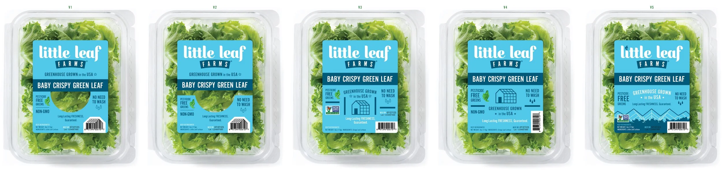
These are the first iterations for the Crispy Green Leaf Lettuce package redesign. We actually loved the first one V1, but after creating a prototype and viewing it on the grocery store shelf with these other designs, the solid label V5 won our favor. From there we iterated further on the illustration and messaging until we got the final you see below.

“I’ve been fortunate to collaborate with Sara on a number of design projects - both professional and personal - over the past 10+ years. When I started working on the Marketing team at Little Leaf Farms, I knew I could trust her with a variety of important projects to level up our visual brand identity: new product labels, branded shipping materials, infographics, and office design. Many of these projects involve complex subjects or a very specific set of requirements, and Sara is always able to fully take in all of the details and add her design expertise to make them a success! Sara’s approach is highly collaborative, incorporating feedback and new information into her projects until everything is just right, and bringing thoughtful suggestions to the table. I’m so pleased with every project we’ve worked on together throughout the years, and look forward to many more in the future!”